Thursday, July 30, 2020

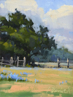
Stormy Fields - Fix It Friday #22


Stormy Fields, 12 x 16, oil on panel, L. Daniel © 2020
SOLD

Today I am revisiting a plein air piece from a dark and turbulent day in 2016. A storm was coming and the sky kept changing with each passing moment. My painting ended up with a sunless sky and a well-lit foreground. Well, which was it? Those fast and furious efforts of mine depicted a contradictory tale. Hmmm...

BEFORE

AFTER

CHANGES

Problem - Sky plane and ground plane disagreed about the light.
Fix - Muted ground plane and added more "lowlights".
Fix - Lightened the sky plane with soft light in clouds.

Problem - Clouds were flat (they were not rain-laden).
Fix - Gave clouds volume by adding a "light side" to the shapes.
Fix - Reinforced the shadow sides of the clouds (to indicate heaviness and the density of moisture-about-to-burst.)
Fix - Developed cloud layers and filled the whole sky to emphasize their size.

OBSERVATIONS

A general "rule" about darks and lights in the landscape is that usually the sky is the lightest plane because that is where the sun lives. Since the ground plane simply reflects the sun's light, it is usually darker than the sky. My original painting had that relationship reversed: the sky was much darker than the ground. (Sometimes a stormy sky can be darker, but this one just wasn't working.)

Also true: Color often appears intensified on a muted, dark day. I did love that intensity, but I totally overdid it with the grasses in my original attempt. As I made other adjustments to make the scene "read" correctly, those needed to be altered too. It was a bit of a toggle...

Thursday, July 23, 2020

Flying High - Fix It Friday #21

Flying High, 16 x 12, oil on panel, L. Daniel © 2020
SOLD

TGIF!! Or, should I say, TGIF-I-F!!! I do love fix it Friday.
This is a painting from last fall that kept catching my attention. I liked it, but something was off and I didn't know what it was. That "nudge" became crystal clear after my last post about finding depth in a painting. (Be careful what you preach... it may come back to haunt you!) ;)

Here's why...

BEFORE

AFTER

CHANGES
Problem - The sky plane was... flat! The cloud layers all had the same treatment of light, shadow, shape, and color. 
Fix - Created scale shift between foreground clouds (made bigger) and background clouds (made smaller). 
Fix - Removed contrast from background clouds (made them more muted, less highlights).
Fix - Added contrast to foreground clouds (gave more color, stronger highlights).
Fix - Increased gradation of blue sky from muted at the horizon to more intense at top.

Problem - Ground plane was also a bit flat.
Fix - Added marsh creek into layers to create a sense of space and depth. (It breaks up the marsh grass and reflects the sky.)

OBSERVATIONS
I remember this day, I was in the moment, responding and having fun. It is so easy to forget principles when we are in the thick of things. And, sometimes it takes awhile for awareness to catch up. Now, I can relax into the scene when I look at it! Ah...

Sunday, July 19, 2020

Creating Depth in a Painting - 5 TIPS!

Morning Reflections, 9 x 12, oil on panel, L. Daniel © 2010

Dear Blog Friends,
I was recently invited to write a guest post for "Realism Today", an online newsletter for artists. It went live this week, and here it is in its entirety. It's long, but it has lots of good info! (Click the title to see it in its original context.) Enjoy! 
___________________


Guest post for Realism Today by Laurel Daniel

One of the most common challenges for beginning painters is learning to establish the feeling of distance in a landscape. It is a hurdle I remember well from my own early efforts… scenes looking flat, backgrounds jumping forward, and no sense of visual space to travel into. With much study and years of practice, I have discovered a number of ways to create that illusion of depth I so badly wanted back then. Below are five tips that have helped me in my journey, with examples for each. They can be considered individually, but I think you will find their actual use is very interconnected. Hopefully, the ideas will help you “see” your subject matter better.

1 - Atmospheric Perspective
Atmospheric perspective, or aerial perspective, is a technique that uses modification of tone to create a sense of depth. Simply described, natural conditions like fog and light have a softening effect on distant layers of the landscape. This impacts a painter’s color and value choices. I like to describe them in these two ways… 


A) As objects move further away from the viewer: values become less contrasty, colors get weaker and cooler, and details become less distinct. 
B) As objects come forward and closer to the viewer: values have more contrast, colors get stronger and warmer, and details become sharper. 

In “Foggy Coastline” below, you can see this concept at work. Notice how each mountain range becomes weaker and cooler as it recedes into the distance. Conversely, the closest mountain range and people have greater contrast and more detail. The warmest/strongest color is in the sandy foreground.

Laurel Daniel, "Foggy Coastline", 9x12, oil on panel, plein air, contact artist

2 - Scale Shift 
With the term scale shift, I am referring how our vantage point effects the appearance of size. Objects look smaller in size as they get farther away from us. Using this size shift helps us further enhance the feeling of depth in our paintings. When working with this concept, it's all about comparison in the big picture. Observe the relationships between “like” elements in foreground, middle ground, and background (compare grasses to grasses, clouds to clouds, etc), and incorporate the incremental differences as they actually occur in nature. 


In “Morning Reflections” below, we see this scale shift with the grasses in ground plane and the clouds in the sky… both elements are larger in the foreground and get smaller in the distance.

Laurel Daniel, Morning Reflections, 9x12, oil on panel, plein air, contact artist


3 - Spacial Increments
Similar to scale shift where objects get smaller in the distance, the spaces between those objects also decrease. This is especially true for evenly spaced elements, like telephone poles, train tracks or orderly planted fruit trees in an orchard. Being intentional with this incremental change will not only give the illusion of depth, it will also keep the ground plane from looking flat. 


In “Fruited Valley” below, notice how the spaces decrease between the vertical rows of grapevines as they go back, and between the horizontal rows of trees dividing the distant fields. 

Laurel Daniel, "Fruited Valley", 24x30, oil on canvas, studio, private collection

4 - Overlapping Elements
Whenever a painter can partially cover one object with another, it gives the appearance of depth. Why? Because we can instantly identify layers, and layers create space.

In “Palm Tree Promenade” below, we view the ocean cove, mountain, and sky through the overlapping palm trees. This relationship (combined with a significant scale shift from foreground to background) establishes a great sense of depth. 

Laurel Daniel, "Palm Tree Promenade", 8x8, oil on panel, plein air, private collection

5 - Practice, practice, practice!
Look for examples of these principles when selecting subject matter for paintings. I think you will find that searching with this in mind will also provide a jump-start with analyzing, composing and blocking in your chosen scene! If you can see it, you can paint it! Practice with a purpose. 

In “Half Light” below, all of the ideas are at work… see if you can find them: atmospheric perspective, scale shift, spacial increments, and overlapping elements. 

Laurel Daniel, "Half Light", 15x30, oil on canvas, studio, private collection

Thursday, July 16, 2020

Country Field - Fix It Friday #20... and PleinAir LIVE!

Country Field, 8 x 6, Oil on canvas, L. Daniel © 2020
SOLD

I posted this "Fix" last year, long before I thought of doing this series of "Fix It Friday" on a weekly basis. Since this has been a *busy week for me, I am posting it again. (I couldn't miss my 20th week in a row of Fix-It Friday!) And I think this painting's changes are worth revisiting...

(*See Out-takes from PleinAir Live at the end!)


BEFORE

AFTER

CHANGES
Problem - Main tree was too perfectly round and static.
Fix -  Gave the main tree a more interesting shape by cutting back into it with the sky and distant tree line. 

Problem - Distant trees were not receding or separating enough from front tree.
Fix - I cooled down distant row of trees.

Problem - Too much weight on the left side. 
Fix - Added more fencing on the right. The added fence counterbalances that weight and creates a more specific "path" into the scene.

Problem - The highlights did not convey the light of that day.
Fix - Lightened up the highlights on the trees.

Problem - There was no reference to the season.
Fix - Added Bluebonnets. It was Texas in Spring, and I just HAD to!! Bluebonnets were everywhere else and I had plenty of reference. 

OBSERVATIONS

This is another case where I had stuck a little too close to reality and lost the feeling! It comes down to this question - what is more important: aesthetic or reality? I say aesthetic. Sometimes it is necessary to adjust reality a bit to accurately portray what we SEE and FEEL about our subject. Permission granted to make changes for the betterment of your painting! 

AND... Below are pictures from my teaching sessions at PleinAir LIVE!

Broadcasting live from the studio of PleinAir Magazine in Austin! 

One presentation included an overview of my process of building a painting and a color mixing demo... 

The other presentation was about overcoming the challenges of painting outside.

Each presentation ended in a Q and A session with Eric Rhodes, publisher of PleinAir Magazine. A HUGE thank you to Eric, the magazine, and to all who signed up!!!

Thursday, July 9, 2020

Glint of Gold - Fix It Friday #19

Glint of Gold, 24 x 24, oil on canvas, L. Daniel © 2020

Hello friends! Welcome back to Fix It Friday! I hope you are all staying well and finding peace in these challenging times. This pastoral walk down a favorite Texas trail gives me that little getaway that seems SO needed right now. I painted it earlier in the spring when the wildflowers were out, and have been stewing over it ever since, up on the drying shelf... something was bothering me... 

BEFORE

AFTER

CHANGES
Problem - The prominent oak tree in the middle ground appeared choked and flat.
Fix - Removed mass of bushes at base of tree to visually free it up.
Fix - Separated layers in middle ground to increase space and depth. 

OBSERVATIONS
Layers always add an illusion of depth. Separating out several layers in the middle ground area, added to the overall sense of distance. I always like the idea of being able to go further "in" to the scene! 

PAINTERS! Join me at PleinAir LIVE!! 
I am teaching in the PRE-event Beginners Workshop (July 14) on "How Painting Outdoors Differs from Painting Indoors, and Overcoming the Obstacles", AND "The Basics of Oil Painting". It will be a fruitful and fun time! 

Please sign up through my affiliate link: 
https://pleinairlive.com/register?affiliate_id=2514217


Thursday, July 2, 2020

Hydrangea in Blue - Fix It Friday #18

Hydrangea in Blue, 9 x 12, oil on panel, L. Daniel © 2020
SOLD

This painting needed to be fixed, literally, as in repaired. I was taking it home to finish later, and it rubbed against another wet painting in my carrier. I didn't see the transferred paint until all had dried. It was tempting to just toss the whole thing, but I hate not finishing something! ;)

BEFORE


AFTER

CHANGES:
Problem - Painting had unwanted paint transferred from another painting.
Fix - Tackled problem area by building it back up with my dark neutral (ultramarine and burnt siena), as if starting from scratch in that area. But before I began, I oiled out ( with refined linseed oil) and rigorously buffed the entire surface. I often do this when painting back in. It helps the new paint flow on better.

Problem - It needed a background (I wiped out first attempt on location).
Fix - Reworked background colors. I wanted something that would capture the sense of dappled light, and would not fight with the blue of the hydrangea. After a number of attempts, I think I finally got there.

OBSERVATIONS:
Make sure to pack your wet panel carrier properly!
If at first you don't succeed, try, try again... ;)

WISHING YOU A HAPPY FOURTH OF JULY!!