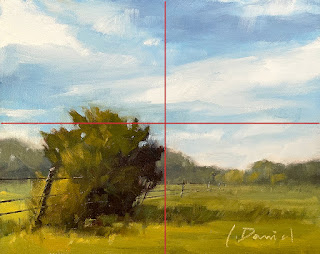
Ranchland, 8 x 10, oil on panel, L. Daniel © 2023
After this demo in a recent workshop, I looked up and immediately saw that my whole subject matter was squished into the bottom left corner of my canvas! I had been talking so much, explaining how to create distance with scale shift and atmospheric perspective, that I forgot all about my composition.
There is a design rule that says, "Never stop your subject at the vertical OR horizontal midline. Make sure it crosses over to avoid cutting your image in HALF." Well, this ranch tree breaks that rule completely. The canvas is cut in half both vertically AND horizontally. Turns out, this was a demo on what NOT to do compositionally and a good lesson in humility for me. ;)
So, here you go, a demo do-over...
BEFORE
PROBLEM
AFTER
Problem - Subject matter is squished into the corner.
Fix - Made subject taller and wider to cross mid-lines of the page.
Problem: All the weight is on the bottom left.
Fix - Added two more trees along the fence line to add weight on the right. This also helps to pull the eye further into the frame.
OBSERVATIONS:
It's a fact of life that sometimes when we are focused on one thing, we completely miss something else! This was a great reminder to stop and assess before getting too far along... whatever you are doing. And, take a do-over if you can!


5 comments:
Hi Laurel!
Isn't it amazing, really, at how our eyes need to readjust to our own work. I loved your painting before and now I even love it more! Thank you again for your excellent instruction. Have a great summer!
Beautiful painting! I love getting little lessons from you. Have a wonderful June!
Thank you, Teri! It really is a funny phenom how the eyes adjust, fill in, see what they want to see... Haha! Glad you enjoyed the the workshop and that you like the revision!!! :) Happy summer to you too!
Thank you, Penny! And you are so welcome for the tips! We all learn from each other! Happy June to YOU! (I can not believe it's already here!)
It’s Fix It Friday at Ranchland! The perfect time to tackle those repairs and get your gear in top shape. While you're at it, don’t forget to check out a Krazy Klean discount code for an easy and effective way to keep your equipment spotless. Whether you're fixing, cleaning, or upgrading, today’s the day to get it done. Who else is excited for a productive Friday?
Post a Comment