
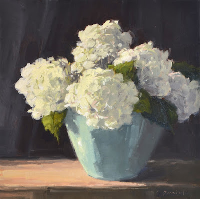
Turquoise Vase, 24 x 24, oil on canvas, L. Daniel © 2019
SOLD in solo show "Beaches, Birds and Botanicals"
I do love a vessel full of Hydrangeas, and I was very happy when a sweet young couple shared that love and snapped up this piece! It's fun to see young families picking mutual favorites, imagining a place on their walls, and thoughtfully building their art collections. Well... let's face it, it is fun to see ANYONE building their art collection!
For my painter friends out there, here is a tip I find most helpful...
I often talk about my general painting process, but with this piece I want to emphasize the importance of building your paintings on a foundation of big shapes and simple values. Why? Because working from simple to complex sets you up for a much more satisfying finish than diving straight into the details. AND, hydrangeas are a great subject to illustrate that principle.

My block-in focuses on large shapes of shadow and light.
I purposefully avoid the individual petals of the flowers... EVEN THOUGH there are millions of them. My goal at this point: authentic shapes, edges and profile.

Going to color, I hang on tightly to the simple shapes.
I keep the shadow and light families separated, and I am still avoiding individual petals! My goal at this point: a subject that is recognizable by shape before any "detail" is added. I often want to stop at this point because I love the simplicity (and sometimes I do!) ;)

At completion, details emerge but my foundational value shapes remain.
I loosely suggest petal detail with subtle shifts within the light family, and
subtle shifts within the shadow family. And never the twain shall meet (meaning, the two value ranges do not overlap much or at all.) In the end, the shadow and light patterns tell the story, not the details! (Click HERE to see the painting "details" in a high res image.)
___________________________
2019 PLEIN AIR WORKSHOP INFO:
November 8-9, 2019 - Austin, Texas
2020 PLEIN AIR WORKSHOP INFO:
March 30-April 2, 2020 - Wimberley, Texas
Contact Helena Hauk, Wimberley Artists Workshops, 800-327-1913
Date is firm - details coming soon!
April 16-18, 2020 - St. Simons Island, Georgia
Contact Mary Anderson, Anderson Fine Art Gallery, 912-634-8414
4 comments:
Have always loved your work, Laurel! Your painting of the pomegranate hangs next to my recliner and I often gaze at it during the day... gives me great joy! Question... Frequently, I use your process info and pics to show my classes and they had 2 questions I couldn't answer... 1) what colors do you use for your value blockins and do you wait for them to dry before beginning painting. I'm assuming you don't when doing plein air work... Paint on!!
As always I learn so much from your beautiful work and your explanation. Luscious work.
This is beautiful Laurel,
Just magnificent. Thank you for your wonderful art,
and for sharing it with us.
XOXOXOXOXO Barbara
Thank you, Maren, Sharon and Barbara! I love hearing from you al!
Maren, in answer to your questions...
1) For my block-ins I use what I refer to as my "dark neutral", a mix of ultramarine and burnt sienna. If you mix them just right, it produces a rich black. I don't premix it, and because I mix as I go, it also has some variety. If you try it you will see this: more burnt sienna in the ratio makes it lean brown, and more ultramarine in the mix makes it lean blue. Mix until it's neutral.
2) I do not wait for it to dry before painting back in. However, I do keep that mix dryer and thinner (NOT runny at all). Keeping it dryer makes it easier to paint back in to.
A third question you DID NOT ask is how do I keep it from turning everything muddy? so...
3) It is important to know that when you paint back in, you must not scrub. Scrubbing in the next layers causes them to mix with the dark base and turn muddy. Subsequent layers need to be thicker and laid in with a very light touch. Set it on top and leave it on top. AND... Because I am using the dark neutral mostly to indicate shadow form, it tends to reside in areas I want muted and darker anyway.
I hope that helps!
Post a Comment